Missionary ministry · Mongolia
A ministry's new site, built for readers who read slowly and give carefully
Grow Mongolia is a Mongolian-led ministry. We are building its new site for donors, partners and Mongolian believers: large readable text, a map and globe of where the work reaches, a story index, an editor for its own staff, and giving on the page. It is in progress and not yet on the client's own address.
IO CreativeWebsite, CMS, Hosting4 min read
Ran on
- Next.js
- Sanity
- Tailwind CSS
- Netlify
- Cloudflare
On this page· The problem
The problem
Grow Mongolia is a Mongolian-led ministry that supports Mongolian believers reaching their own nation, and the nations beyond. Its first website was built in a design tool and looked like a software landing page: big thin type, cards that reveal on hover, cursor effects.
Its readers are not software buyers. Donors are often over 55 and church-affiliated, on a desktop, deciding whether to trust the ministry with money. Partners are churches and organisations weighing a formal relationship. A third group is Mongolian believers themselves. A site designed to impress did not serve any of them well.
It was designed to be admired. It had to be read.
How we defined it
We set one posture for the whole site: quiet authority, a well-run institution rather than a startup. Six principles came from it, and the first of them settled the rest: legibility is the brand.
- Large, dark, generously spaced text, with a control to make it larger still.
- Navy does the interaction; crimson is a measured highlight, and the Give button.
- The facts on every page come from the ministry's own annual report, in one place, so a figure is never retyped.
- The ministry's staff change the site themselves, without a developer.
- Ready for Mongolian: the text face carries the full Mongolian Cyrillic set, not only the common letters.
How we solved it
We rebuilt the site from scratch rather than porting the old one. It is a Next.js site with Tailwind and a content editor, hosted on Netlify, in the ministry's own colours: navy, crimson and gold, taken from its flag. About fifteen routes cover the home page, Why Mongolia, Stories and updates, Pray, Give, and a Learn group for who the ministry is, what it does and where it works.
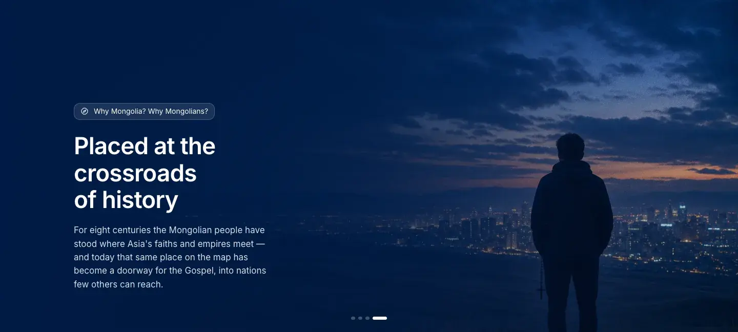
Pages open on a hero chosen from a shared pool of photographs, each showing a shuffled few, so the pages never look the same twice. Photographs carry a light film grain so they read as photographs. The home page opens on a short aerial video of the steppe, served from a separate media server so the page's own host stays light.
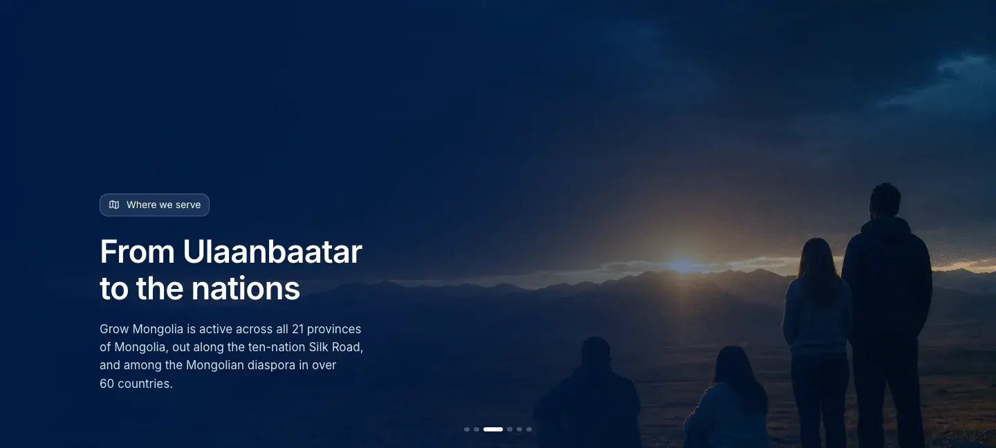
Some pages are interactive. On the home page a province map tours Mongolia and a globe lets a visitor pick a country to see what the ministry does there. The Why Mongolia page carries a map of the 10/40 window, and Where We Serve lets a visitor pick a region to see its photograph and facts. All of it reads from the ministry's own report.
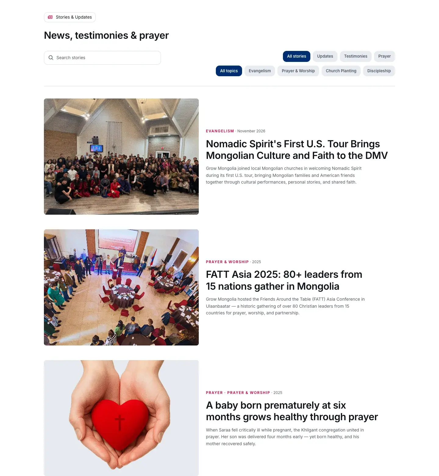
Stories and updates, the FAQ, partners, leadership and every page's text are edited by the ministry's staff in a content editor, with no code. Staff can also create new pages, and reorder, hide or add sections on the built-in ones.
Step by step
Built to be read, and edited.
- Read with ease: Large text, and a control to make it larger.
- See the reach: A province map and a globe, from the ministry's report.
- Staff edit: Stories, pages and sections, in the editor.
- Give: A donation form on the page, swappable later.
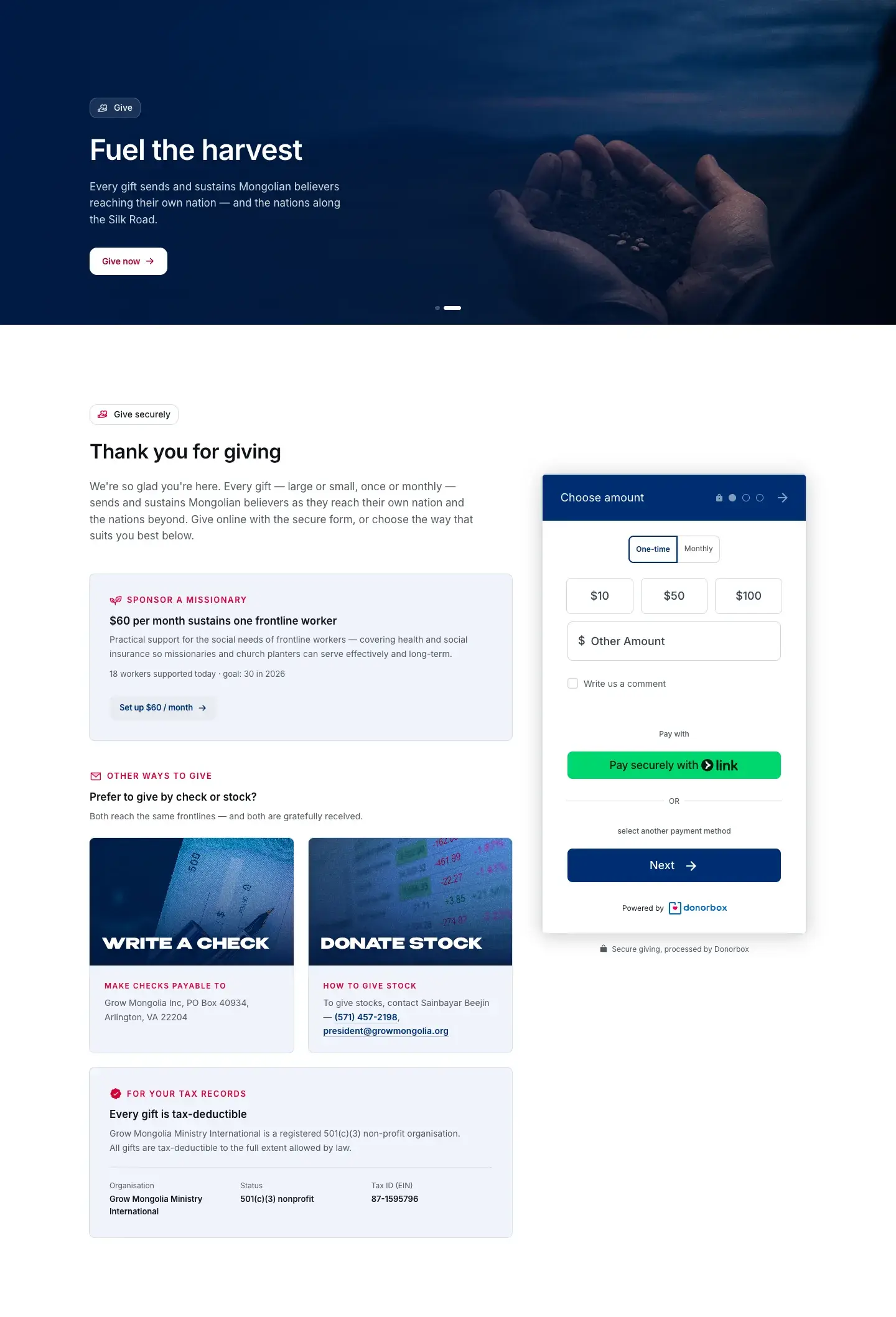
Giving is a donation form set into the Give page and the home page. It is the ministry's interim tool, so we built it as a swappable part: when the ministry moves to a new giving and donor system after launch, the form changes and the rest of the site does not.
What we applied
Design
Type and colour
Text is set in Inter, in two weights. The ministry's flag colours do the work: navy as the ground and the interaction, crimson as the highlight, gold as a small accent. Corners are kept at a modest radius on cards and controls, with no pills.
Motion
Motion is calm. The home hero is a slow aerial video; the loading mark lifts once the page is ready; a hero image shuffles between photographs. A short quiz about Mongolia, one random question with a congratulation, opens when a visitor is about to leave, or from a lightbulb in the margin.
On a phone
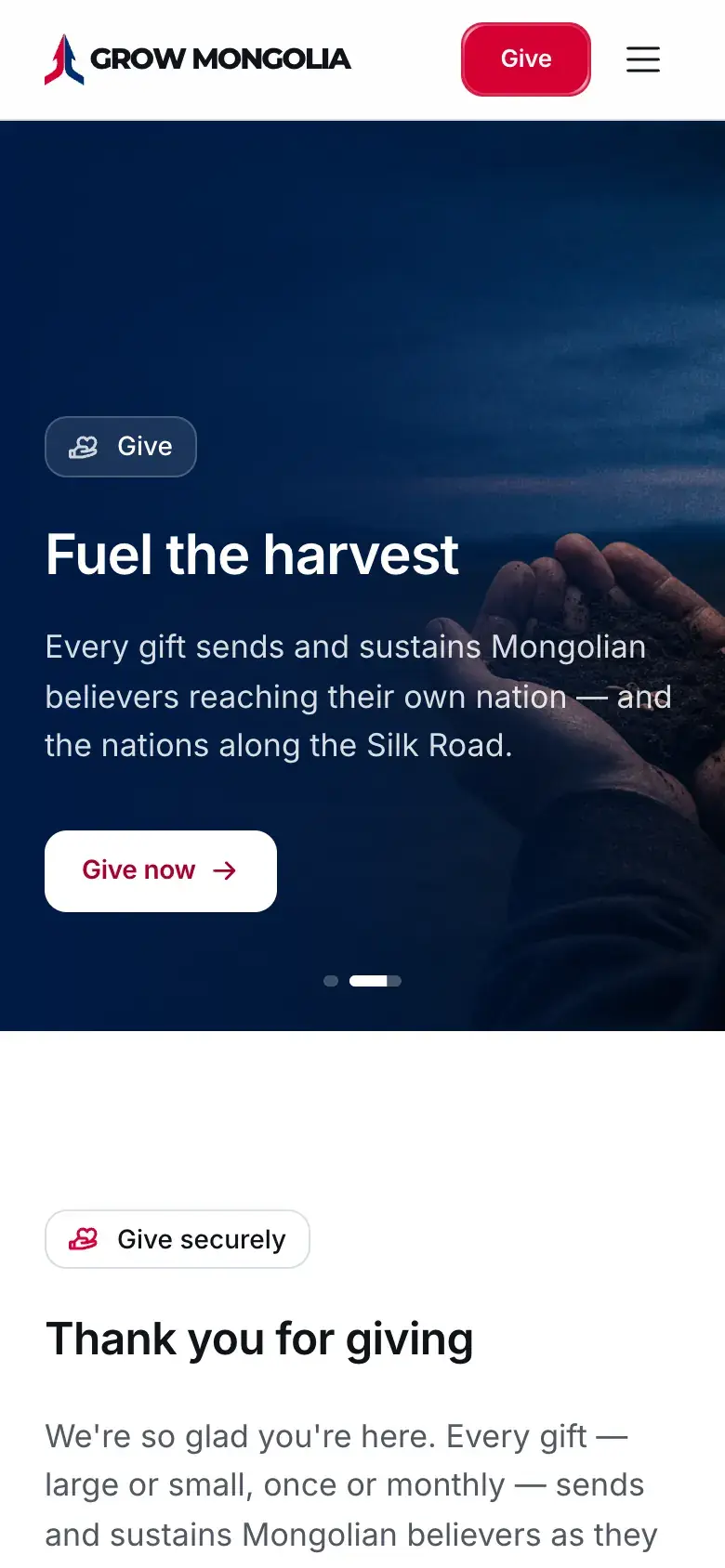 Give
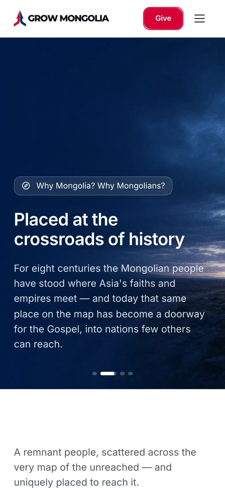 Why Mongolia
Media weight
The hero video moved to a media server and photographs load lazily below the first screen. We kept the photographs at full size on purpose: every smaller version showed visibly less of the grain that makes them feel like photographs.
Where it stands
The site is on a preview address, closed to search engines, while the ministry gets its domain and editor logins ready. Launch is waiting on that, not on the design. When it goes live, this page will say so and link the real address.
Results
One number we measured ourselves, with where it came from and when. It is not the ministry's own figure.
- 6.10 to 3.76 MBdownloaded on a first desktop visit that only sees the first screen, after the hero video and images moved to the media server and lazy loading.Measured by us · Chrome, cache off, preview site before and after · October 15, 2026