Down arrow opens its links.
    IO Creative AgencyIO Creative Agency
    • Services
      • Website developmentBuilt, hosted and cared for: fast sites you own.
      • AI developmentAI features inside the tools you already use.
      • Agentic AIAgents that handle repeat work; you approve.
      • Website reviewA measured review of the site you have.
      • AI coursesOnline, and in person in Virginia.

      Featured

      Website review

      A measured review of your site: speed, search and accessibility, each finding with its evidence.

      How the review works
    • Work
      • Case studiesWhat we learned building them, written up.
      • ExperiencesThe client sites we built and still look after.

      How we show work

      Measured, not claimed

      Every client page shows the live site and one number we measured ourselves.

      See our experiences
    • Courses
      • OnlineLive sessions you join from anywhere.
      • In person in VirginiaSmall groups, hands on, in Northern Virginia.
      • Next cohortDates, seats and what you will build.

      Courses

      AI for small teams

      Practical AI you use at work the next day, online or in a room with us.

      See all courses
    • Website review
    • About

    Try: , , ,

    Switch to dark theme
    Book a callBook a call
    • Services
    • Work
    • Courses
    • Website review
    • About
    Book a callBook a call
    1. Home/
    2. Experiences/
    3. Lantuun Dohio

    Child-protection charity · Mongolia and the United States

    A child-protection charity, with a home built for kids and read by adults

    Lantuun Dohio works to end human trafficking and protect children in Mongolia and around the world. We built its website in English and Mongolian, with animated characters, a map of its centres, and giving that never leaves the page.

    IO Creative·Website, Animation, Hosting, Maintenance·November 17, 2026·3 min read

    Ran on

    • Next.js
    • Tailwind CSS
    • Netlify
    • Cloudflare
    • Resend
    Visit lantuundohio.org
    lantuundohio.org
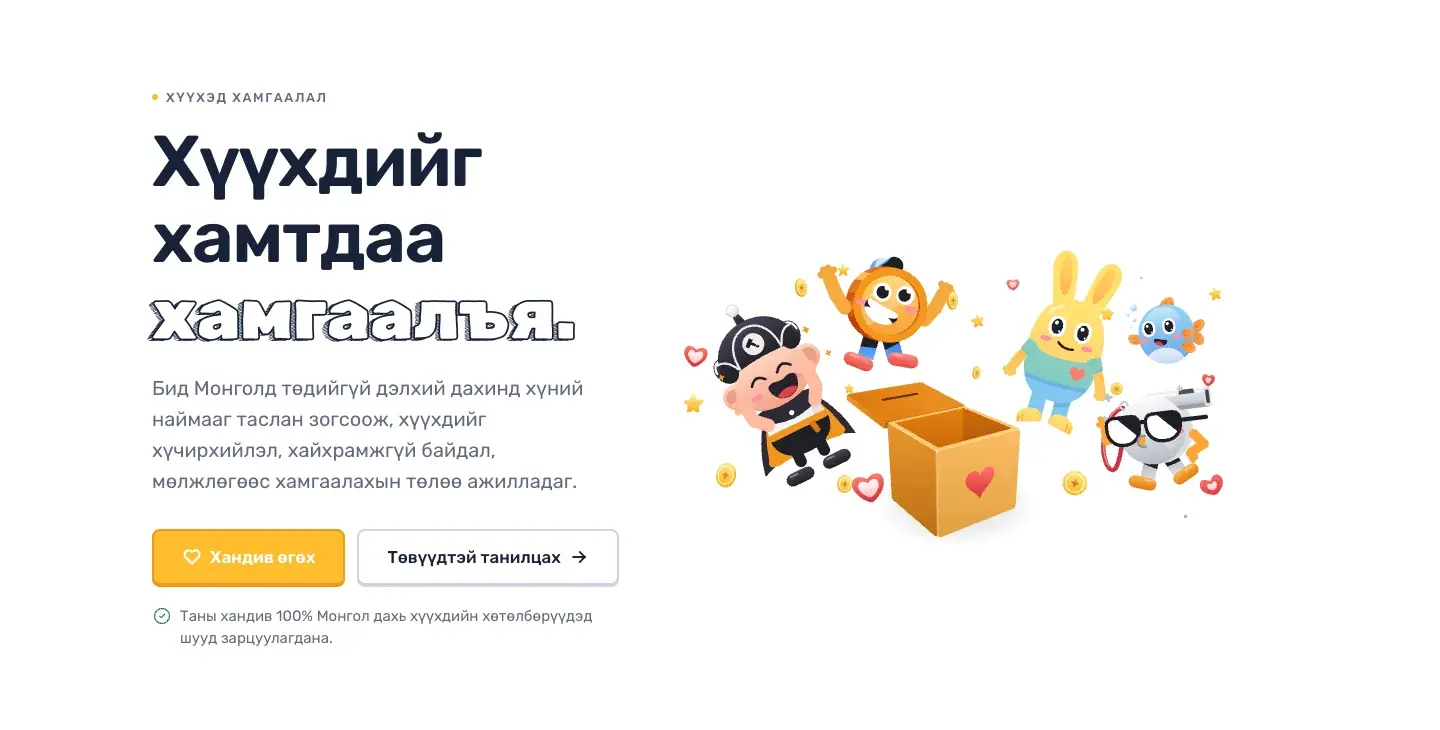
    The live home page, recorded 2026-11-17. The characters play around a donation box while the page reads in plain words.
    On this page· The problem

    On this page

    • The problem
    • How we defined it
    • How we solved it
    • What we applied
    • Design
    • Type and shape
    • Motion that earns its place
    • Two languages
    • On a phone
    • News and updates
    • Our vision

    The problem

    Lantuun Dohio protects children from violence, neglect, abuse and exploitation. It runs safe centres in Mongolia, and it raises its money from people in the United States and Mongolia who have never seen the centres.

    That is a hard story to put on a website. The subject is serious, the readers are adults who decide whether to trust and give, and the children it serves are the ones the page should feel made for. A site that is too cheerful would trivialise the work. A site that is too heavy would lose the donor in the first screen.

    It had to feel like it belongs to kids, and inform adults.

    How we defined it

    • Show the work first, not the problem: the centres, the children's days, the people.
    • Give two honest tones their own places. Playful for the home and the programmes; plain and still for money, reports and anything official.
    • Make giving feel part of the site: no jump to another website.
    • Write it twice, properly: English, and Mongolian written for Mongolian readers.

    We did the design first as a board of decisions, then built the pages from it. Colour, type, shapes and motion were each settled on the board before a page used them.

    How we solved it

    The site is built in Next.js and Tailwind and hosted on Netlify. Every page is built from one kit of parts: a header and footer, page heads, sections, cards, forms, buttons. If a page needs a part that is not in the kit, the part is added to the kit first.
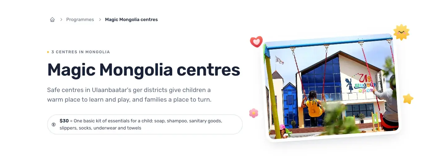
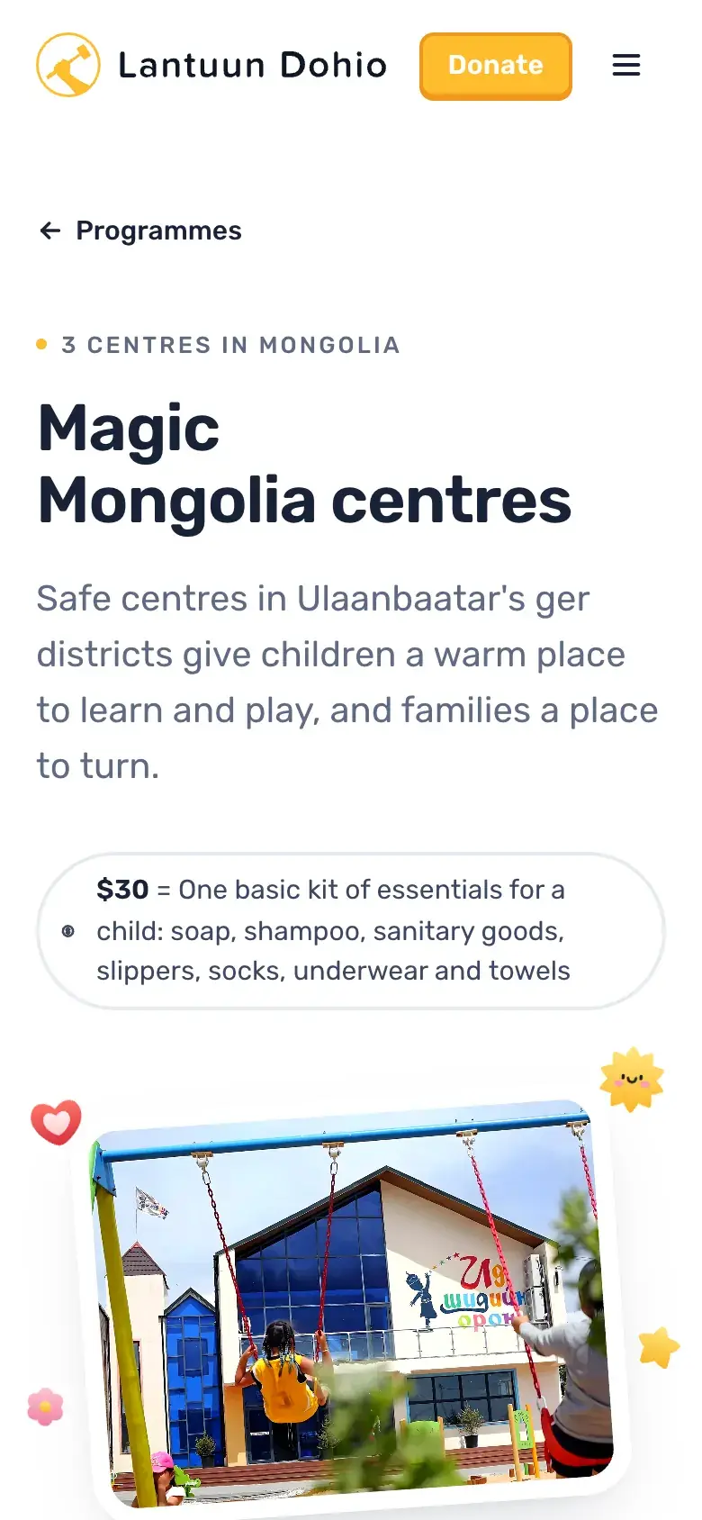
    The Lantuun Dohio Magic Mongolia centres page: the headline 'Magic Mongolia centres', a line about safe centres in Ulaanbaatar, and a photograph of children on swings in front of a centre.
    A programme page: what the centres are, what one gift buys, and a real photograph of the place.

    A map shows where the centres are: two in Ulaanbaatar's ger districts and one in Dundgovi. A visitor taps a pin and sees the centre. Real photographs of the centres and the families are used throughout; the site uses no stock photography.

    Giving stays on the site. The give section offers one-time and monthly amounts as large tiles; choosing one opens the donation form inside the page, already filled with that amount. The form itself is the charity's donation provider, set into the page so a donor never lands on someone else's website.

    Step by step

    A kit of parts, then the pages.

    Read, understood, given, maintained.

    1. Read the work: Centres, programmes and reports, in plain words.
    2. In two languages: English, and Mongolian written from meaning.
    3. Give on the page: The donation form opens inside the site.
    4. Kept up to date: Hosted and maintained, so it stays current.

    The whole site exists in two languages. English lives at the plain addresses, and Mongolian at /mn. The Mongolian is not a line-by-line translation: it was written from the meaning, in the wording the charity itself uses for its work.

    What we applied

    Design

    A white page that lets the characters carry the colour

    The ground is white. Colour comes from the animated characters and one warm yellow, used for the main actions.

    UX

    Giving where you are

    Every Give button opens the form in a dialog or on the give section. On a phone, the same form as on a desktop, not a smaller cousin.

    Content

    Mongolian written, not translated

    Each Mongolian page was written from meaning, using the charity's own glossary, so it reads like Mongolian from a Mongolian charity.

    Tech

    A heavy animation that loads kindly

    The animated scenes are served in a form the host can compress and cache, so a returning visitor sees them without waiting, and a changed scene reaches visitors on their next visit.

    Design

    Type and shape

    Everything is set in one friendly, rounded sans, with titles at a medium weight and body text at a comfortable size. Two bolder options were tried on the board and set aside as distracting. Corners are rounded to a ceiling, photos included, because the larger radius we tried first looked too round.

    Motion that earns its place

    The characters are advanced interactive animations: a boy, a coin, a whistle, a bunny, a fish. They have rules. A whole scene is used only as a section of its own, never squeezed into a card. On a photograph, a single character may sit like a sticker. Cards do not animate. Serious sections, the ones about money, reports and transparency, stay still. Icons play only on hover or focus, one at a time.

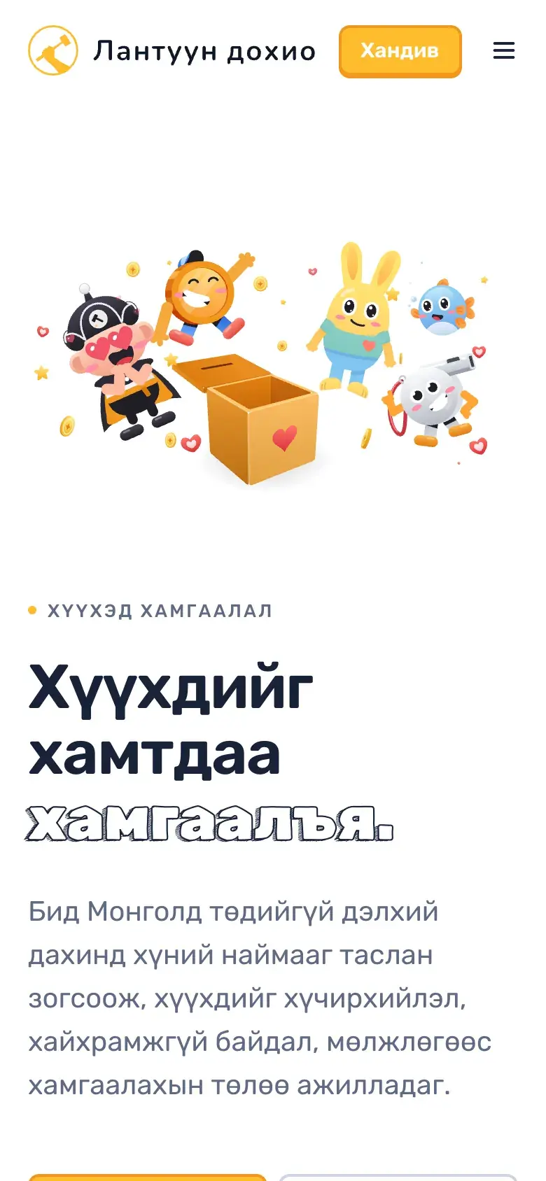
    The same opening at 390 wide: the characters sit above the headline, and the Donate button stays within reach.

    Two languages

    The Lantuun Dohio home page in Mongolian: the headline in Cyrillic, the same characters, and a yellow button reading 'Хандив өгөх'.
    The Mongolian home page at /mn: the same design, written for Mongolian readers.

    On a phone

    The Lantuun Dohio Magic Mongolia centres page on a phone: the headline, a line about the centres, and what a thirty-dollar gift buys.Centres
    The Lantuun Dohio home page in Mongolian on a phone: the animated characters above the Mongolian headline.Mongolian
    A programme page and the Mongolian home page at 390 wide.

    News and updates

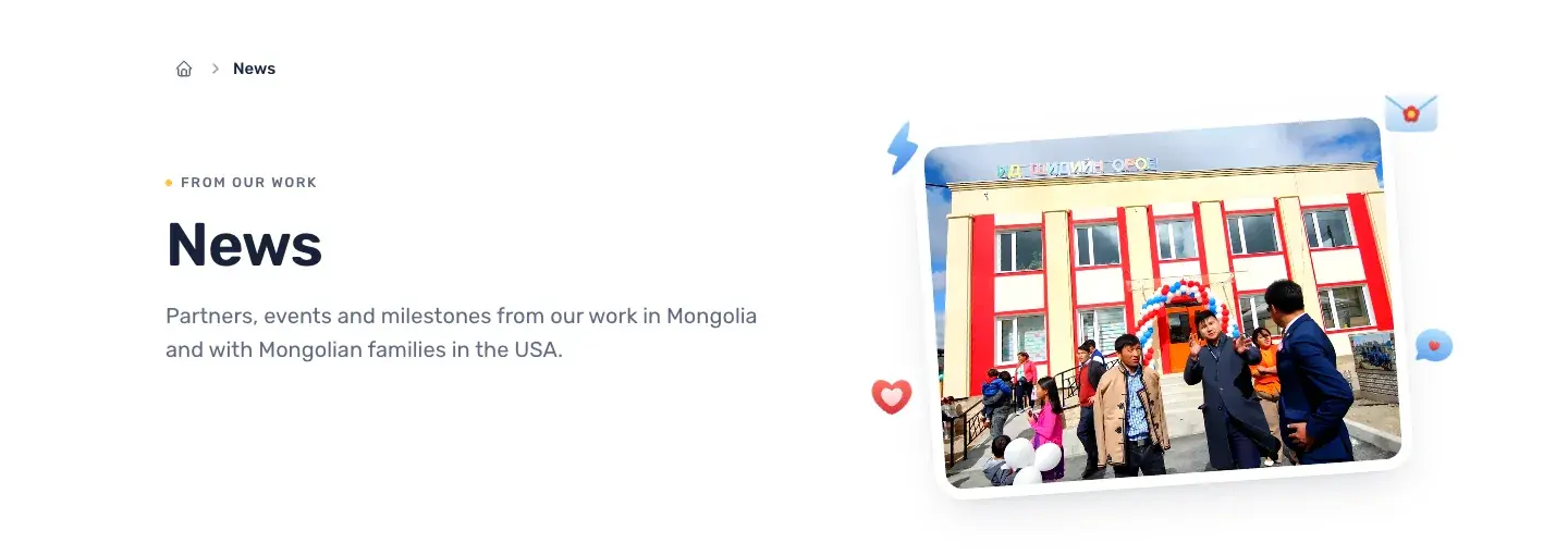
    The Lantuun Dohio news page: the headline 'News' and a photograph of a centre opening day with a crowd and a balloon arch.
    News: milestones and events from the work in Mongolia and with Mongolian families in the USA.

    Our vision

    The site went live on 2026-11-12. We keep it hosted and updated, and small changes to existing content are part of that. Larger work, such as new pages, new features or changes to how giving works, is quoted before it starts.
    On this page

    • The problem
    • How we defined it
    • How we solved it
    • What we applied
    • Design
    • Type and shape
    • Motion that earns its place
    • Two languages
    • On a phone
    • News and updates
    • Our vision
    Previous caseAnura MusicMusic school, Falls Church, VirginiaNext caseGrow MongoliaMissionary ministry, Mongolia

    The same care, for your site.

    One team builds it, measures it and keeps it running.

    We look at what you have.

    The site, its speed, its search.

    We fix what matters most.

    Measured before and after.

    We keep it that way.

    Hosting, updates and a weekly report.

    A site like this, for you?

    Show us what you run today. We reply with what we would fix first.

    IO Creative AgencyIO Creative Agency

    Websites, AI development and courses, built in Virginia.

    Get the next cohort date

    One email when the next AI course date is set. Nothing else.

    Notify me

    Contact

    hi@iocreative.org

    Services

    • Website development
    • Hosting and care
    • AI development
    • Agentic AI
    • Website review
    • AI courses

    Work

    • Case studies
    • Blog
    • Experiences

    Company

    • About
    • Contact
    • Book a call

    © 2026 IO Creative Corporation

    • Privacy
    • Terms
    • Accessibility