Insurance and savings app · Mongolia
Life insurance and savings, built for a phone and a short visit
Mobilife sells education savings and life insurance entirely inside a telecom's own app. We are designing and building it: the screens, the way a parent moves through them, and the animated scenes that make a long-term promise easy to see. It is in development, and this page shows the working build.
IO CreativeApp design, UX, App development5 min read
Ran on
- Next.js
- React
- Tailwind CSS
- TypeScript
On this page· The problem
The problem
Insurance and long-term saving are decisions parents make rarely and carefully. The people we are building this for are roughly 28 to 55, subscribers of a telecom operator in Mongolia, with a mid-range Android or an iPhone. They will open the app for a few minutes, between other things, to protect their family and to start saving for a child's education.
The usual way to do this is a form, a branch visit, and a lot of small print. A tool that asks parents to trust a promise that pays out in fifteen years has to explain itself in a few taps, in their own language, and make the number feel real.
The product has to be understood and bought in one short visit, on a phone, by someone who is deciding something serious.
How we defined it
The client's developers set a few rules early, and we treated them as the brief. They shaped every screen.
- No sign-up, no password, no login code. The app opens already signed in, because the telecom's own app has already tied the person to their phone number.
- One identity check, once. The state's e-ID is used a single time to fetch the person's own details and their consent, and again to confirm a child. After that, returning users just see their data.
- One way to pay. A single payment method, with a monthly deduction day the parent picks and an initial payment set at the start.
- One journey pattern. Every product is bought through the same step ring and step list, and each step opens in place.
From that we set three design goals: a parent should understand what they are buying before they pay, should always know which step they are on, and should be able to leave half-way and continue from the same place.
How we solved it
The app is a web mini-app that runs inside the telecom's app, not a store app, so there is nothing to install and no separate account. It is built in Next.js and Tailwind, with a mock of the server in front of it, so every screen could be designed and checked before the backend was ready. The screens are in Mongolian.
Opening the app for the first time shows a short story of four beats: protect the family, save for the children, pick up where you left off, confirm once. A card on each beat shows the kind of notice the app will send, so the story doubles as a tour.
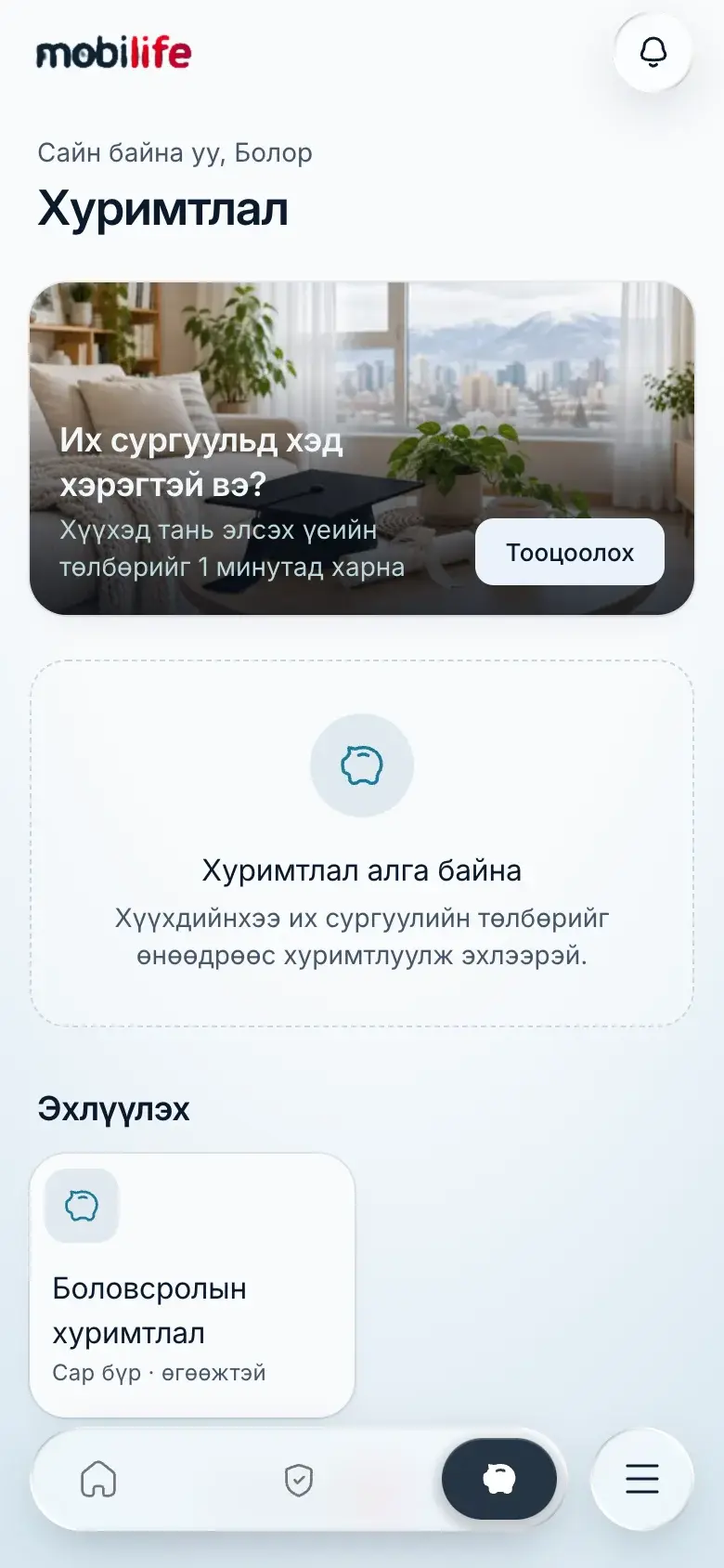 Home
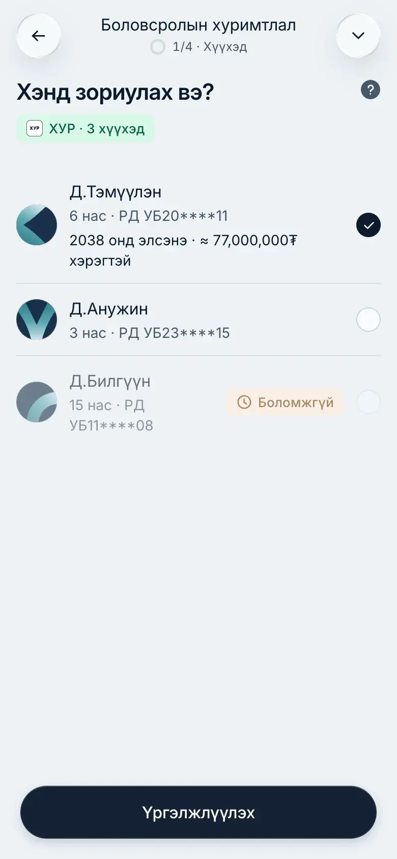 Who is it for?
Saving for education is four steps: choose the child, set the goal, set the monthly amount, confirm the contract. The goal step is where the product becomes visible. A tree stands for the child's future, and moving one slider changes the sum the plan aims for. The next step shows a jar that fills as the monthly amount grows.
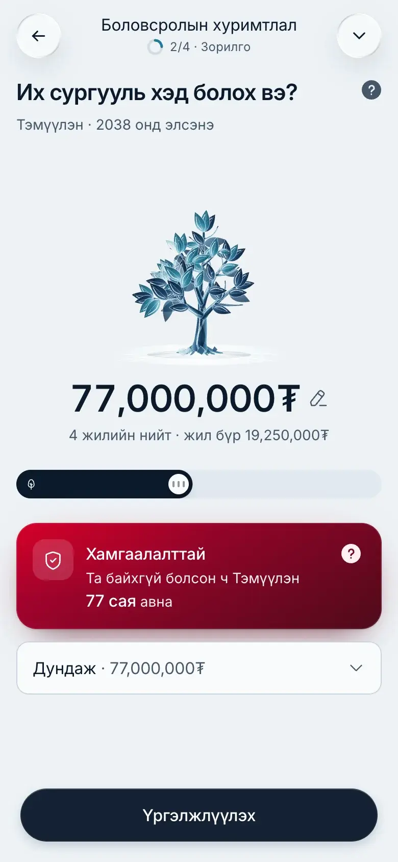 The goal
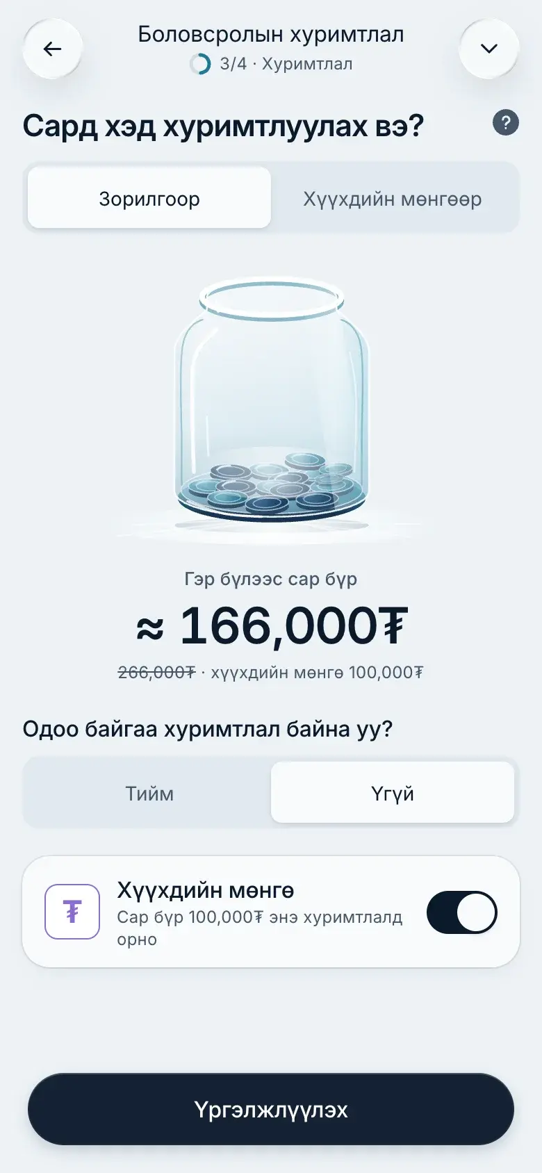 The monthly amount
The last step is the contract itself, written as a short summary first and the full terms below in folding sections, so the parent reads what matters before reading everything.
What we applied
Design
Type: one family that reads Mongolian well
All interface text is set in Inter. We tried the logo's own typeface for headings and body and it did not hold up on screen, and Inter covers the Mongolian letters Ө, Ү and the tugrik sign. The round face stays only for the logo. Money is set large and tabular, so amounts line up.
Colour: midnight and ice
The ground is a pale ice grey, the text and primary buttons are midnight blue, and the teal accent carries information. The brand's red stays for the logo and the cover card, so it keeps its meaning.
- Ice ground#EDF2F6 · Page
- Card#F8FAFC · Surfaces
- Midnight#0B1A2C · Text and primary
- Teal#1F7A99 · Accent
- Brand red#DE0023 · Logo and attention
Shape and layout: touch first
Everything is for a thumb. Corners follow four fixed roles (chip 8, control 12, card 20, sheet 32), so a card never looks like a button. The bottom of every screen is either the navigation or one full-width button, never both and never a floating action. Success and errors arrive as pop-ups, so the page under them never rearranges.
Motion: scenes that react to the user
The animated scenes are real interactive animation, not looping decoration. Each one is driven by a single number from the screen: the cover sum morphs a shield from light to strong, the monthly amount fills the jar, the goal grows the tree. We built a small library of them (14 so far) and show the client two or three variants on the design board before one is chosen. They are drawn to match the app's glass and ice look.
Where it stands
Mobilife is in development and in review with the client. The first-open story, home, the education savings journey and the contract step are built and run in the browser on sample data. Several parts are still marked In review on the design board, among them the savings tab for several children, the home dashboard, a quick add-money sheet and a QR code on every child's plan. The client sends rounds of changes, and each one is worked through in the same board-first way.
We have not launched it, and we claim no result from it. Each part on this page is what the working build does today.
Our vision
The product can grow the way families do: a child, then a second child, then relatives who add to a plan by scanning a code, then insurance cover that sits beside the savings. The components, the design board and the mock server mean each of those is an addition, not a rebuild. When the backend goes live, the same screens will run on real data.