Down arrow opens its links.
    IO Creative AgencyIO Creative Agency
    • Services
      • Website developmentBuilt, hosted and cared for: fast sites you own.
      • AI developmentAI features inside the tools you already use.
      • Agentic AIAgents that handle repeat work; you approve.
      • Website reviewA measured review of the site you have.
      • AI coursesOnline, and in person in Virginia.

      Featured

      Website review

      A measured review of your site: speed, search and accessibility, each finding with its evidence.

      How the review works
    • Work
      • Case studiesWhat we learned building them, written up.
      • ExperiencesThe client sites we built and still look after.

      How we show work

      Measured, not claimed

      Every client page shows the live site and one number we measured ourselves.

      See our experiences
    • Courses
      • OnlineLive sessions you join from anywhere.
      • In person in VirginiaSmall groups, hands on, in Northern Virginia.
      • Next cohortDates, seats and what you will build.

      Courses

      AI for small teams

      Practical AI you use at work the next day, online or in a room with us.

      See all courses
    • Website review
    • About

    Try: , , ,

    Switch to dark theme
    Book a callBook a call
    • Services
    • Work
    • Courses
    • Website review
    • About
    Book a callBook a call
    1. Home/
    2. Experiences/
    3. IO Institute

    Programming school · Mongolia

    A school's Framer site, rebuilt in code and made light

    IO Institute teaches programming in Mongolia. Its site was built in Framer, with a 3D hero and heavy media. We rebuilt it as a Next.js site that keeps its look and loads a fraction of the weight, with the questions and pricing editable by the school.

    IO Creative·Website, Framer to Next.js, Media, Hosting·November 17, 2026·5 min read

    Ran on

    • Next.js
    • React
    • Tailwind CSS
    • Sanity
    • Netlify
    • Cloudflare
    • Resend
    Visit ioi.mn
    ioi.mn
    The live home page opening, recorded 2026-11-17: the loading screen, the hero scene, then the first scroll.
    On this page· The problem

    On this page

    • The problem
    • How we defined it
    • How we solved it
    • What we applied
    • Design
    • Type: Inter for reading, Manrope for the small labels
    • Colour: black, white, one violet
    • Layout: a 1200 column and room to breathe
    • Motion: it sets the tone, then steps aside
    • On a phone
    • Results

    The problem

    IO Institute is a programming school in Mongolia. Its flagship is a one-year programme that takes a student to working software engineer, taught with AI tools beside the code and run together with a partner university. The audience is young, on phones, and reads Mongolian.

    The school already had a site, built in Framer. It looked the part: near-black, a moving 3D hero, a looping video. But that look came at a cost. Images uploaded at their original size were shown at the size of an avatar, and a first visit pulled over seven megabytes before the visitor had scrolled.

    A school that teaches modern engineering needed a site that behaved like good engineering: fast, and in the school's own hands.

    How we defined it

    The look was right and the school did not want a redesign. So the job was to move the site to code without losing what it already was, in this order.

    • Keep the design exactly. The colours, type, spacing and motion were read from the live site and carried across as tokens, then checked side by side at three widths.
    • Cut the weight, not the effect. The 3D hero and the video stay; everything around them gets lighter.
    • Let the school edit what changes. The questions and the pricing belong to the school, so they should not need a developer.

    How we solved it

    We rebuilt the site in Next.js and Tailwind, section by section: the hero, the case for the programme, how it fits the learner, why the school, the programme itself, student stories, the video, frequently asked questions, the tech stack and a contact block. Then a pricing page and a contact page. The whole site is in Mongolian, set in a typeface that carries Cyrillic.
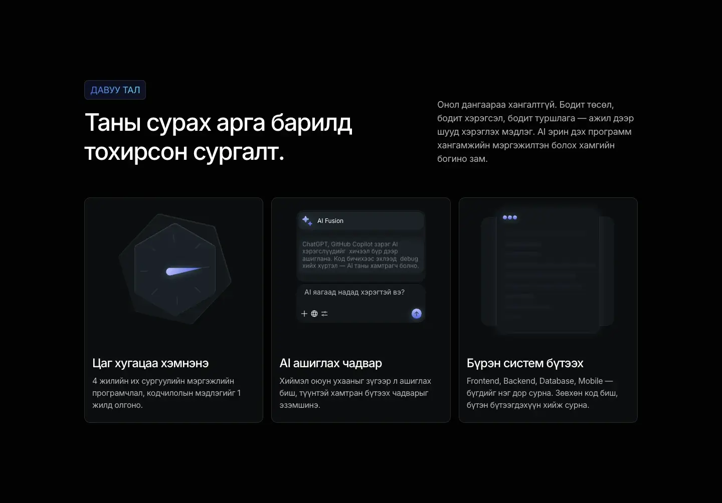
    The IO Institute home page, section 'Таны сурах арга барилд тохирсон сургалт': a label, a two-line headline and three dark cards, each with a small animated picture: a dial, a chat with an AI assistant and a stack of systems.
    The 'learning that fits you' section: three cards on the same near-black, each with a small moving picture.

    The hero is a 3D scene. It takes time to start, so we added a loading screen that stays until the scene reports that it is ready, and the page never flashes empty while the scene loads.
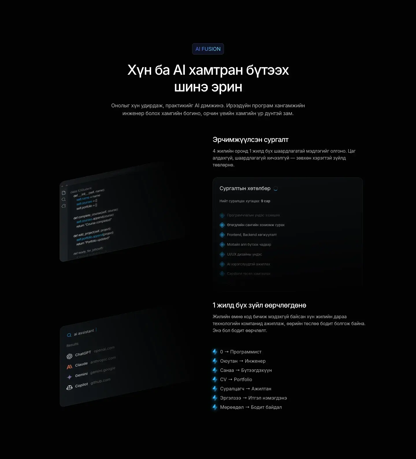
    The programme section: the headline 'Хүн ба AI хамтран бүтээх шинэ эрин' above a tilted code editor picture and a card listing the subjects.
    The programme section: a tilted editor beside the subject list.

    Then the media work, which is where most of the weight was. The looping video now comes from a separate media server, starts loading only when it is about a screen and a half away and plays only while it is on screen. Avatars and the logo that were uploaded at several thousand pixels were re-encoded to the size they are shown. The contact badge, itself about a megabyte, loads when it is near the screen instead of on arrival. A guard runs before every build and fails it if a file goes over the budget, so the weight cannot creep back.

    The frequently asked questions and the pricing page are written by the school in a content editor. A published change appears on the site within a minute, with no deploy. The contact form sends its message by email to the school.
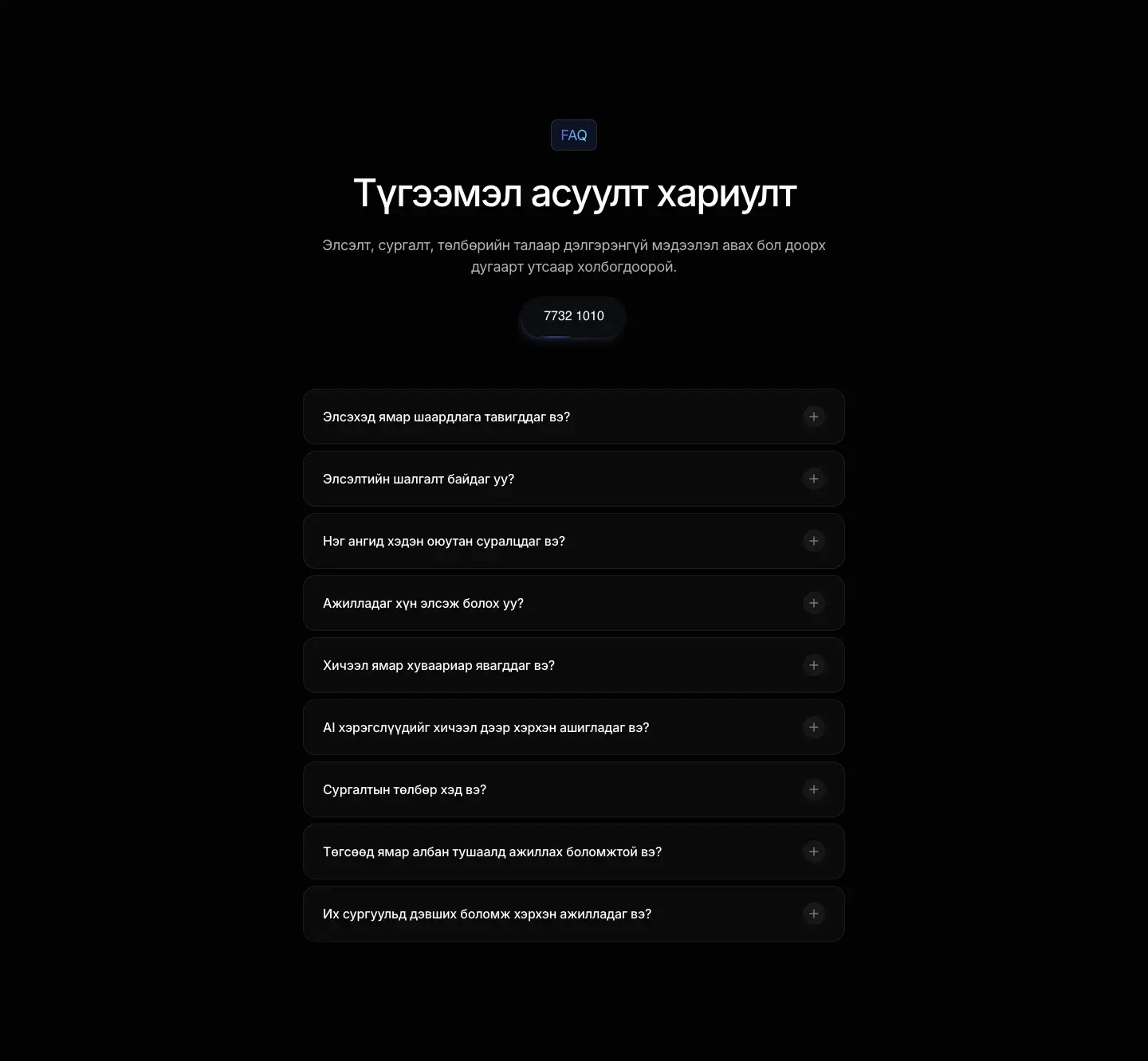
    The FAQ section: a label, the headline 'Түгээмэл асуулт хариулт', a phone number pill and a list of collapsed questions.
    The questions section, filled from the school's own editor.

    What we applied

    Conversion

    Rebuild what the page does, not what it was exported as

    A Framer export reproduces the look but carries Framer's runtime and its habits. We kept the few pieces that needed to be exact and rebuilt the rest as ordinary components, so the page can be read, changed and made fast by any developer. React's strict mode stays off, because the site's animation misbehaves under it.

    Performance

    Weight is a decision made once and checked every build

    Heavy things are loaded when they are about to be seen, and large files are not allowed to ship unless someone writes down why. The budget is a file in the project, so the next change is held to the same rule.

    Content

    The school edits; nobody redeploys

    Questions and prices are the parts of a school's site that change every term. They live in an editor the school already uses and the pages refresh themselves within a minute.

    Design

    Type: Inter for reading, Manrope for the small labels

    Headlines and body are Inter, including its Cyrillic letters. The small spaced-out labels above each section, like the 'AI Fusion' tag, are Manrope in an accent colour. Headlines are tightly tracked and medium weight so a long Mongolian line still sits calmly.

    Colour: black, white, one violet

    The ground is almost black and the text is white at three strengths: full, 70 and 40 percent. Surfaces are a hair lighter than the ground and separated by an eight percent white line. The one accent is a soft violet, used for labels. The colour in the hero comes from the 3D scene itself, so the page stays neutral around it.

    • Ground#020202 · Page
    • Surface#0B0D0F · Cards
    • Text#FFFFFF · Headlines, body at 70%
    • Violet#BFA2F6 · The one accent
    The site's colour tokens, as set in its stylesheet.
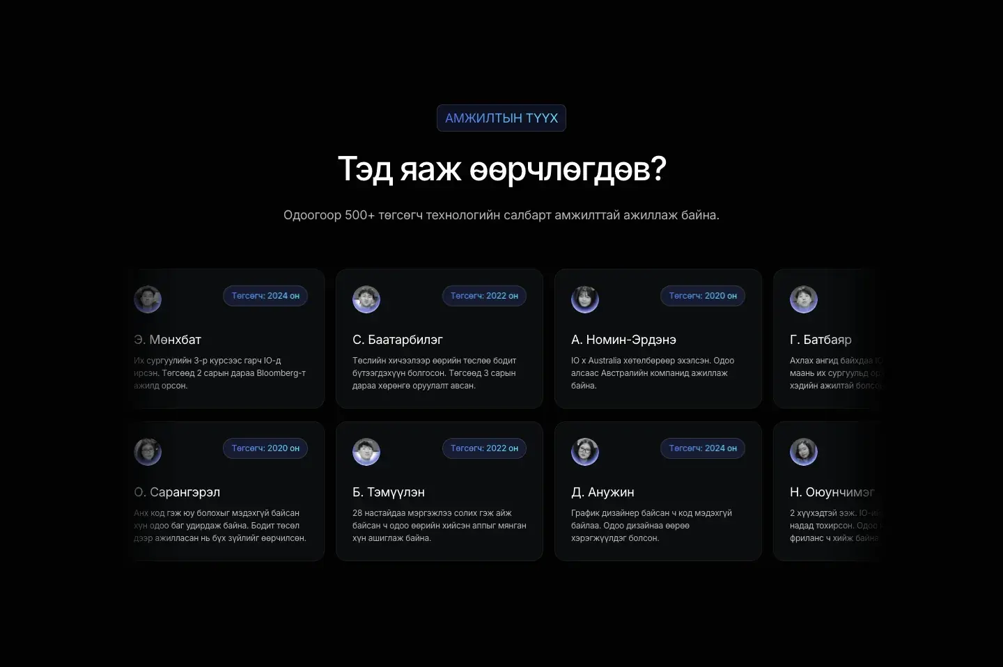
    The student stories section: the headline 'Тэд яаж өөрчлөгдөв?' above two rows of student cards, each with a photo, a name, a year and a short quote.
    Student stories as two rows of cards.

    Layout: a 1200 column and room to breathe

    Everything sits in one 1200 pixel column with generous space between sections. Cards are the unit: a card for a feature, a card for a student, a card for a question. The tech stack section ends with a field of tool logos that fills a card on the right.
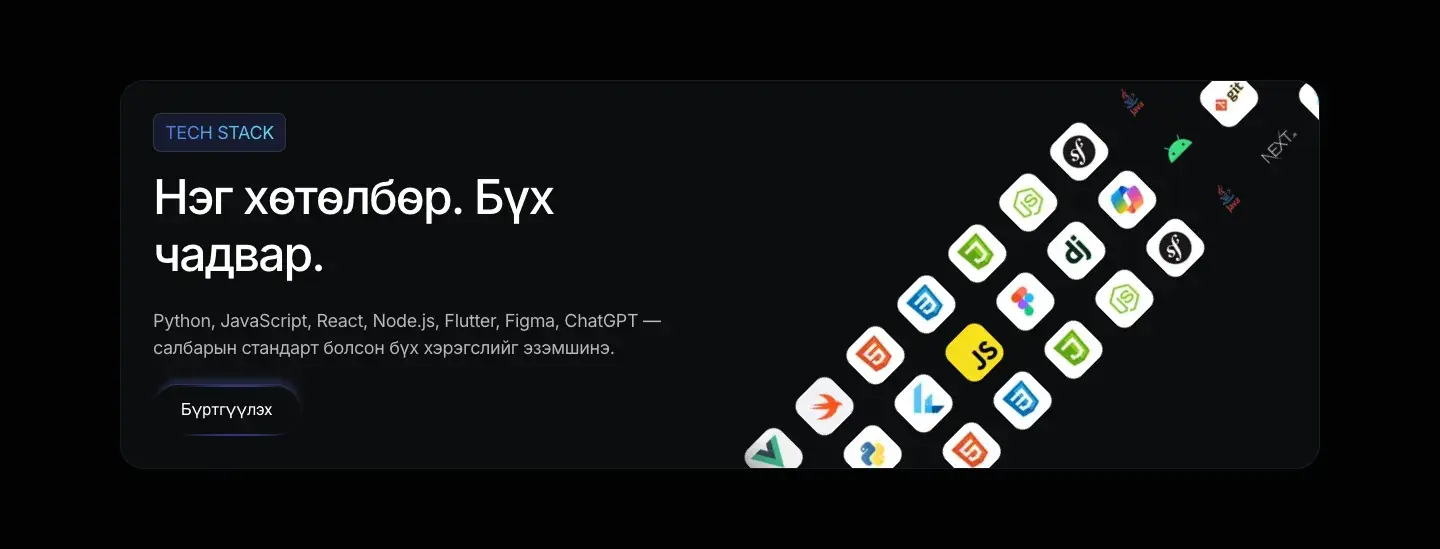
    The tech stack section: a card with the headline 'Нэг хөтөлбөр. Бүх чадвар.', a list of languages and tools and a button, beside a tilted field of tool logos.
    One programme, every skill: the tech stack card.

    Motion: it sets the tone, then steps aside

    The loading screen, the 3D hero and the cards' small pictures give the site its character. The video below them loads when it is close to the screen and plays only while it is on screen. It is the same effect with less loaded, so the site keeps its feel and loses most of its weight.

    On a phone

    The 3D scene was designed for a wide screen. On a phone it is scaled back so its glow does not fill the screen, and the type scale drops by about a quarter so Mongolian headlines do not overflow.
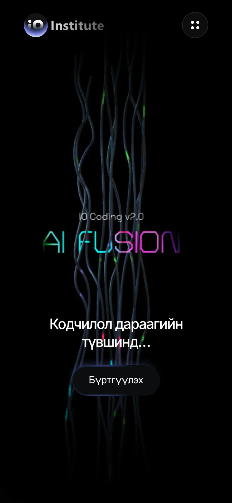
    The same opening at 390 wide.
    The IO Institute home page on a phone: the 3D scene behind the headline 'Кодчилол дараагийн түвшинд…' and a Register button.Home
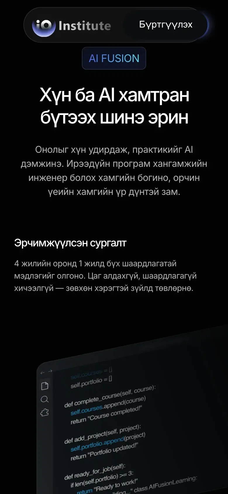
    The programme section on a phone: the headline above a code editor picture and the subject list.Programme
    Home and the programme section at 390 wide.

    Results

    Only numbers we measured ourselves, each with where it came from and when. None of them is the client's own business figure.

    • 7.32 to 1.31 MBdownloaded on a first desktop visit that only lands on the home page, after the heavy media was moved and re-encoded.Measured by us · Chrome, first visit, cache off · October 15, 2026
    • 7.57 to 2.51 MBdownloaded for the whole home page, scrolled to the end. The extra 0.92 MB is the video, which now loads from the media server.Measured by us · Chrome, first visit, cache off · October 15, 2026
    • 7.32 to 1.33 MBdownloaded on a first visit at phone width that only lands on the home page.Measured by us · Chrome, phone width, cache off · October 15, 2026

    On this page

    • The problem
    • How we defined it
    • How we solved it
    • What we applied
    • Design
    • Type: Inter for reading, Manrope for the small labels
    • Colour: black, white, one violet
    • Layout: a 1200 column and room to breathe
    • Motion: it sets the tone, then steps aside
    • On a phone
    • Results
    Previous caseMobilifeInsurance and savings app, MongoliaNext caseiBlack LimoExecutive car service, San Francisco Bay Area

    The same care, for your site.

    One team builds it, measures it and keeps it running.

    We look at what you have.

    The site, its speed, its search.

    We fix what matters most.

    Measured before and after.

    We keep it that way.

    Hosting, updates and a weekly report.

    A site like this, for you?

    Show us what you run today. We reply with what we would fix first.

    IO Creative AgencyIO Creative Agency

    Websites, AI development and courses, built in Virginia.

    Get the next cohort date

    One email when the next AI course date is set. Nothing else.

    Notify me

    Contact

    hi@iocreative.org

    Services

    • Website development
    • Hosting and care
    • AI development
    • Agentic AI
    • Website review
    • AI courses

    Work

    • Case studies
    • Blog
    • Experiences

    Company

    • About
    • Contact
    • Book a call

    © 2026 IO Creative Corporation

    • Privacy
    • Terms
    • Accessibility